We’re excited to share the launch of our new brand identity, a milestone that reflects both our evolution as a firm and our vision for the future.
This rebrand is more than just a new logo or updated colors. It’s about expressing who we are today: a team defined by collaboration, innovation, and a deep commitment to the people and communities we serve. Over time, we’ve grown in scale, expanded our services, and taken on new challenges.
Our new brand reflects that growth while honoring the values that have always grounded us. Those same values that inspired us when Kim founded the company 15 years ago remain just as important to us today.
Why We Rebranded
Every brand tells a story, and we wanted ours to capture both our history and our momentum.
For the last 15 years, we’ve built lasting partnerships with our clients, delivering projects that are creative, purposeful, and human-centered. Many of those partnerships began with our earliest projects, and we’re proud that the majority of our work today comes from repeat clients who continue to place their trust in us.
That history not only grounds us but also continues to shape the way we design and the way we serve. As our practice expanded, we recognized the need for a brand identity that mirrors the energy of our work and the spirit of our team. This was the right moment to make that change—to strengthen how we present ourselves, without changing the principles that define us.
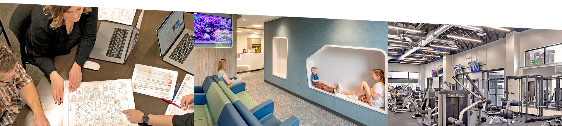
Who We Are
At our core, Dwyer is a trusted team of creative, innovative, and collaborative problem-solvers with an empathetic approach to customized healthcare and higher education architectural design.
Our passionate commitment to your vision begins with a shared, purpose-driven partnership—one designed to make a meaningful difference in the communities we serve. This belief in design as a tool for impact and connection is what sets us apart, and what continues to drive every decision we make.
Our Logo // A Symbol of Connection
At the heart of the rebrand is our new logo. The intertwined “d” is more than a letterform—it’s a symbol of connection. It represents the way we engage with clients, collaborate with partners, and support one another as colleagues. It also reflects our belief that design is never done in isolation; the best solutions emerge from relationships built on trust and dialogue.
Our Colors // A Color Palette with Purpose
Our new color palette was chosen with care. The foundation is a spectrum of calming, creative blues, which embody trust, clarity, and forward thinking. These are complemented by warm neutrals and crisp accents that convey balance, approachability, and energy. Together, these tones create a look that is modern and dynamic, while still grounded and professional—just like the work we deliver.
Our Tagline // Design Done Differently
We’re also introducing a new tagline: design done differently. This phrase reflects the essence of our approach. To us, “different” means listening deeply, challenging assumptions, and seeking innovative answers to complex questions. It means combining creativity with practicality, so our designs aren’t just beautiful on paper, but impactful in the real world. Most importantly, it speaks to the way we partner—with openness, curiosity, and a commitment to creating spaces that truly serve people.
Looking Ahead
Our refreshed brand signals the next chapter in our journey. It highlights our belief in design as a collaborative process and underscores our promise to deliver thoughtful, innovative solutions. While the look may be new, what hasn’t changed is our dedication: to our clients, our partners, and our communities.
That dedication is especially strong in the fields of healthcare and higher education, where design has the power to transform lives. Whether it’s creating healing environments that support wellness or reimagining academic spaces that inspire discovery, we remain committed to delivering designs that are as purposeful as they are innovative. We’re grateful to everyone who has been part of our story so far. This rebrand is a celebration of the trust you’ve placed in us, the relationships we’ve built over the past 15 years, and the successes we’ve achieved together. We’re excited for what’s ahead—and proud to continue building it, side by side.